Fun fact: Humans struggle to interpret graphs.
Regularly, clients like to see graphs in their app. When we hear “let’s add a graph”, we have some important points to highlight:
- Graphs often look better in artist’s renditions rather than on screen. If the data stays relatively constant, for example, the graph may be a single straight line across a screen which portrays little.
- Humans don’t always interpret graphs well. we’ve seen developers arguing over what an actual graph means. These are folks who are used to data; but we still find it is easy to misinterpret.
With this in mind we always advise:
- Try the graph with real data. For speed, we recommend just getting some real data and plotting it with Excel. if you can make this look nice it’s a start
- Now, show your graph to a few colleagues, and ask them to tell you what it means.
If you get consensus, maybe a graph in your app is a good idea. If you don’t, well, we may need to reconsider, or make changes to the graphing style.
Well, nothing like eating your own dog food to prove a point eh? Here’s some recent work we’ve done with a graph.
While enhancing the GAA report app, I asked the team to produce a graph which shows how the scores in the game went. I think this would be a nice addition to the app: A way to quickly visualise the ebb and flow of a game. We’ve also made it such that this can be shared on social media using the share button. Here’s a fictitious example of our first cut:
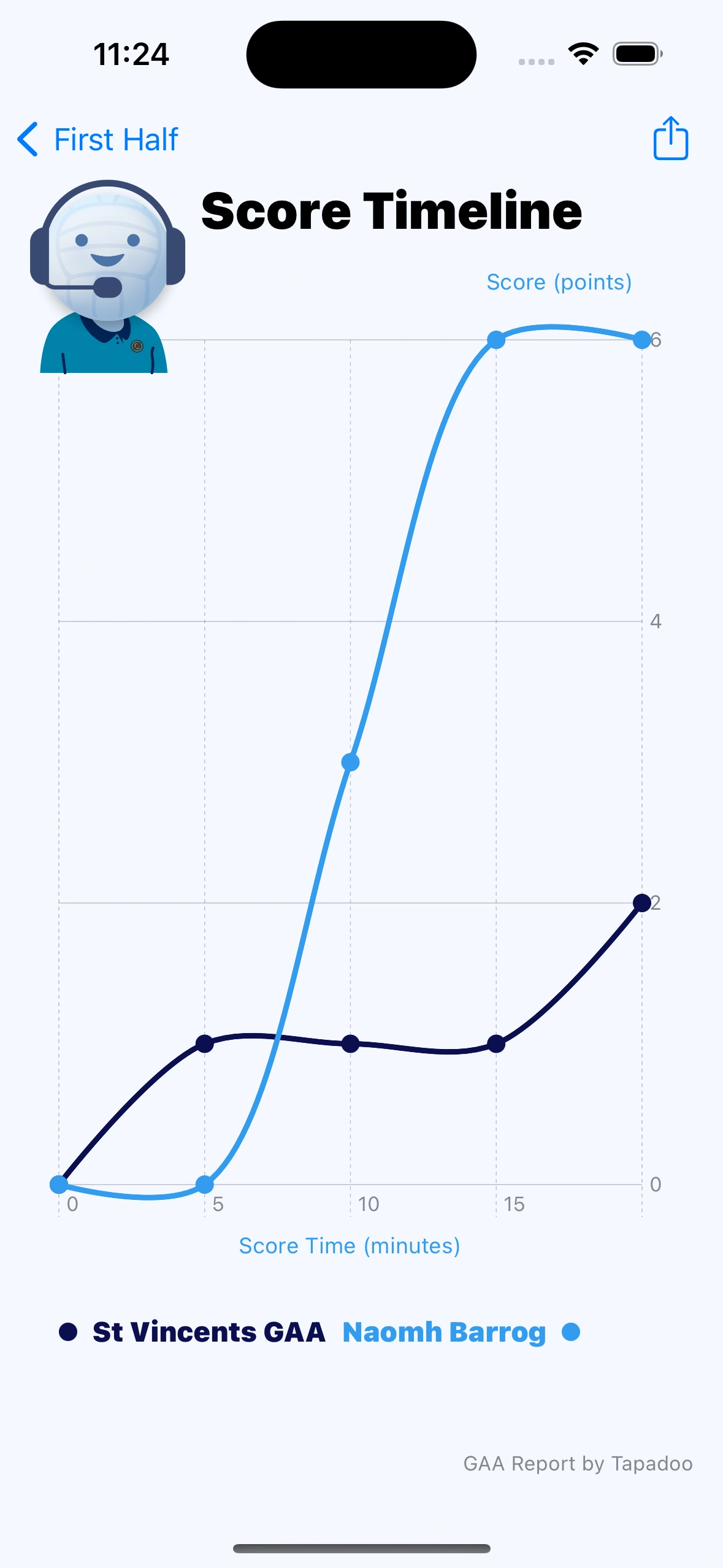 Its pretty enough; But can you interpret it ? I see an immediate issue:
The graph is aesthetically pleasing, but between minute zero and five, the “Naomh Barrog” graph goes below zero. That’s simply impossible in GAA. Between the 5th and 15th minute, the St Vincents score graph appears to go downwards. Again, not possible in a GAA game.
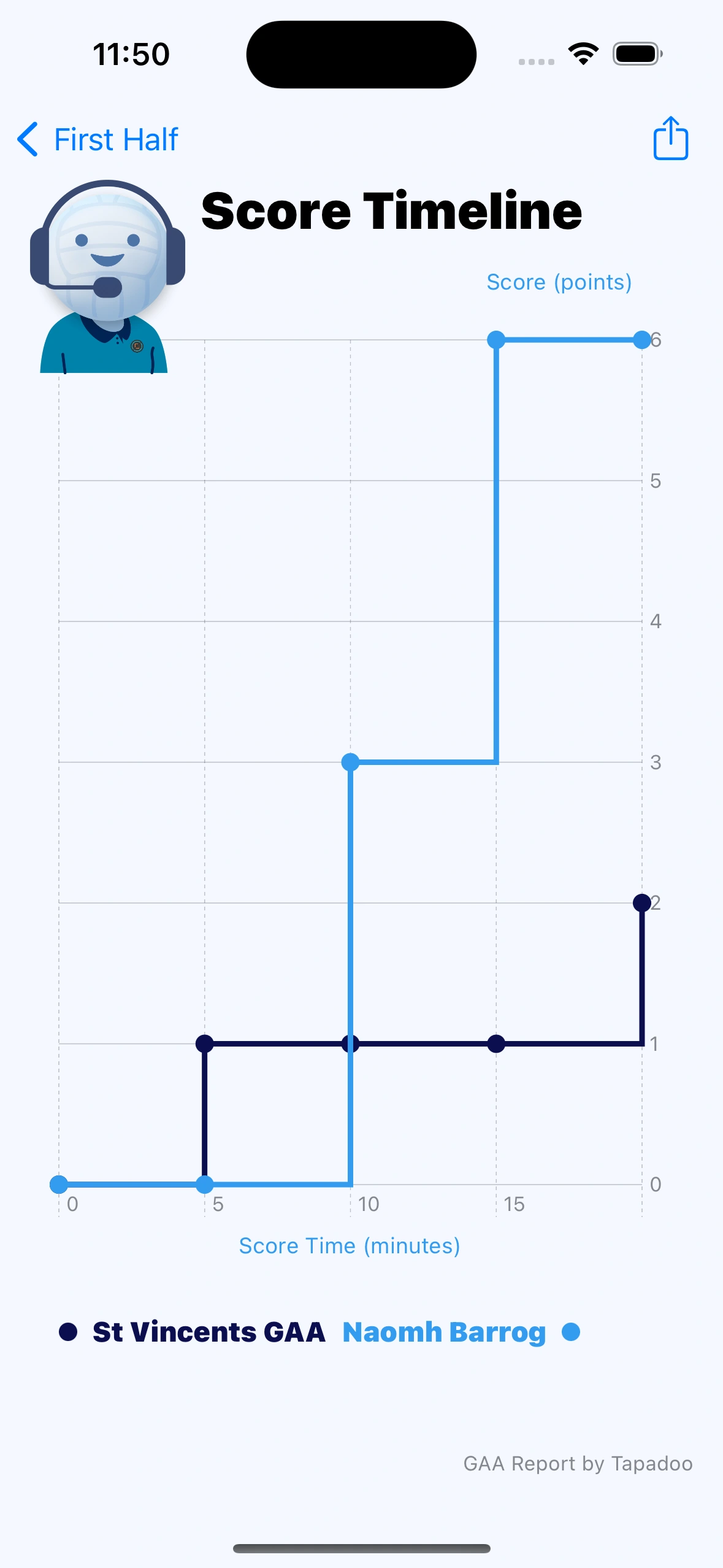
So, let’s fix that

OK, this is more correct - the graphs can’t go in a direction they shouldn’t. This was caused by the interpolation method between points. The new version changes the interpretation from “catmullRom” to “linear”. This is similar to graphs I’ve seen in other sports scoring apps.
But wait! Take a look at the transitions; they are gradual. It suggests that Naomh Barróg gradually jumped by 3 points between the 5th and 10th minute. Points movements aren’t gradual; they are what mathematicians may refer to as “discrete”. In fact, by examining the data we can see Naomh Barróg scored a goal in the 10th minute.
Again we can fix this, by changing the interpolation to “stepEnd”

This is the most correct display, in my opinion. Disappointingly, its not the prettiest and there’s still an issue: when I was staring at it, I thought it had an error - I read it as Naomh Barróg having 5 points, not 6. The graph portrays 6 points, but I misinterpreted it. An extra axis mark may help here:
I think this is better. A Y axis mark for all points is better than a version where it steps by 2.
Take a look at the final version, do you think it portrays the ebb and flow? What improvements would you make?
We’ve still to get our designer to look over it - I’m sure she will improve it more. When we do, we’ll write a follow up post.
Thanks for reading the Tapadoo blog. We've been building iOS and Android Apps since 2009. If your business needs an App, or you want advice on anything mobile, please get in touch