In 2009, when Tapadoo first came to be, like many companies first starting out the identity of the company had been given some thought, but let’s just say it wasn’t the highest item on the list. In time, the company grew steadily and it became clearer who we are, and what we we stood for. Although the beachball had no deep meaning, it was what we’d like to say “aspirational”.
![]()
It has served us well over the last 6 years. However as we continue to grow, we’ve also began to outgrow our beloved beachball logo. Through discussion and design we wanted to explore how the company has grown, and make something that represented both our internal culture, and our clients. We’re not in the mindset that lots of companies are rebranding so we should too. This was something that came about very naturally. Over the last year we have moved to a new premises, doubled in size and are continuing to grow both in staff size and ambition. This signalled to us that it was time to re-examine our brand.
Looking back over the last few months, it’s been a process that has clarified our culture, and opened up conversations about the future of the company. We looked at imagery, words, other logos, values & mission statements. We discussed the like and dislikes and how traits are applied to company cultures and also into branding.
Over the last few months we’ve held a series of branding workshops internally. This was not however “design by committee”. It regularly involved challenging each other on how we perceive our company, what are our hopes for the future, looking at other brands, and picking apart the very essence of who we want to be and why. A small number of staff members attended the workshops, all workshops were very much based around conversations, and most included some kind of practical exercise to initiate conversations. Through this series of workshops, we were able to define our core values as a company, and a mission statement we could stand over. 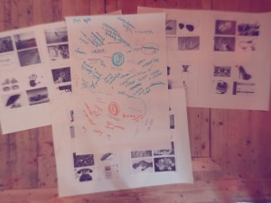

Core Values:
OPEN | HONEST | ENDURING | REWARDING
Mission Statement:
Build the best team, to create the best apps and be the go-to mobile partner.
We began to sketch potential ideas based on the reoccurring themes in the workshops. Initially there were a lot of ideas, lots of variation, but from the many sketches and ideas reoccurring shapes, and representations came through.
Early sketches
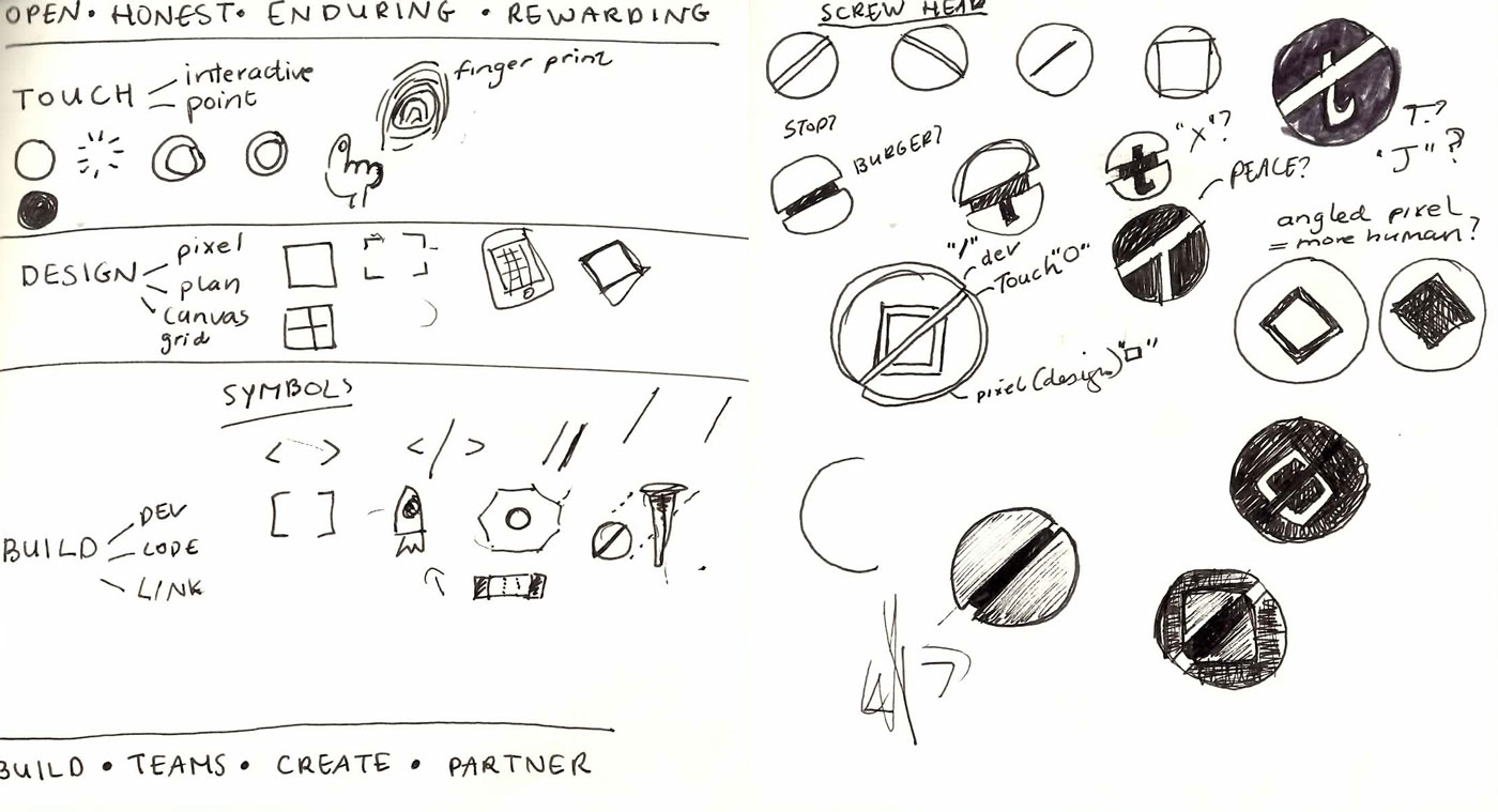
Refining shapes and space
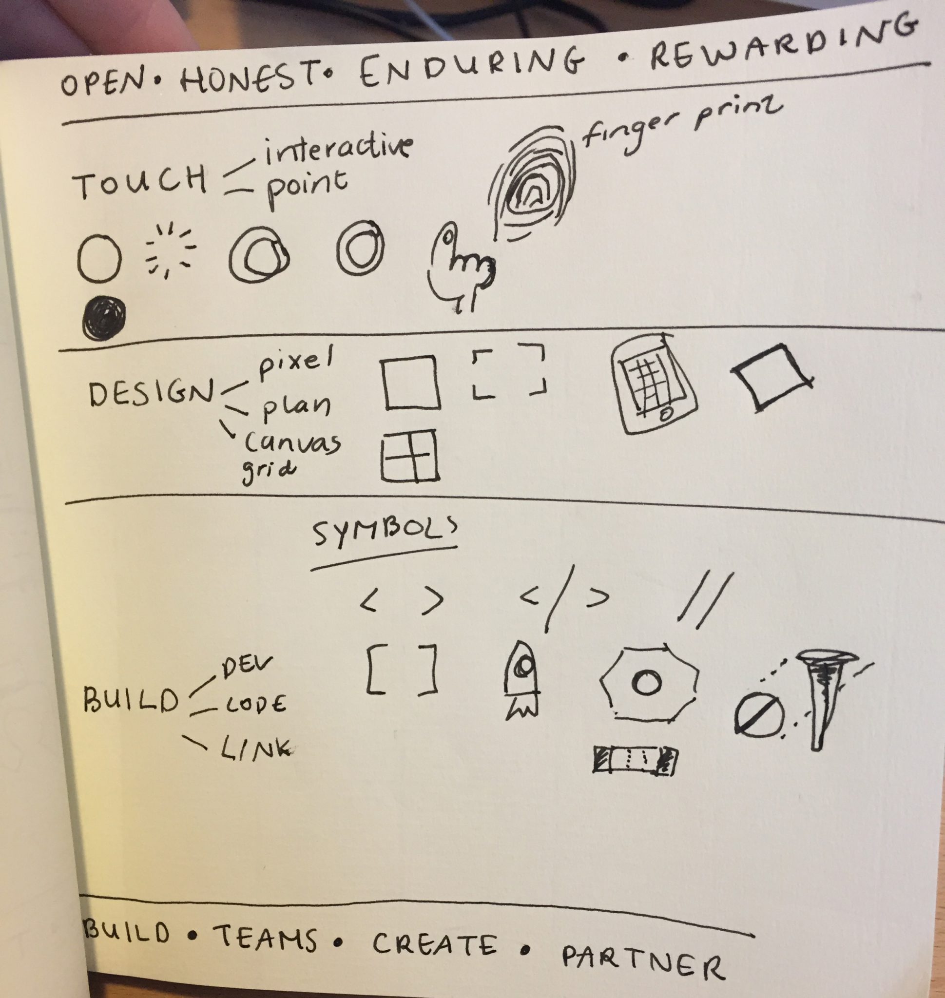
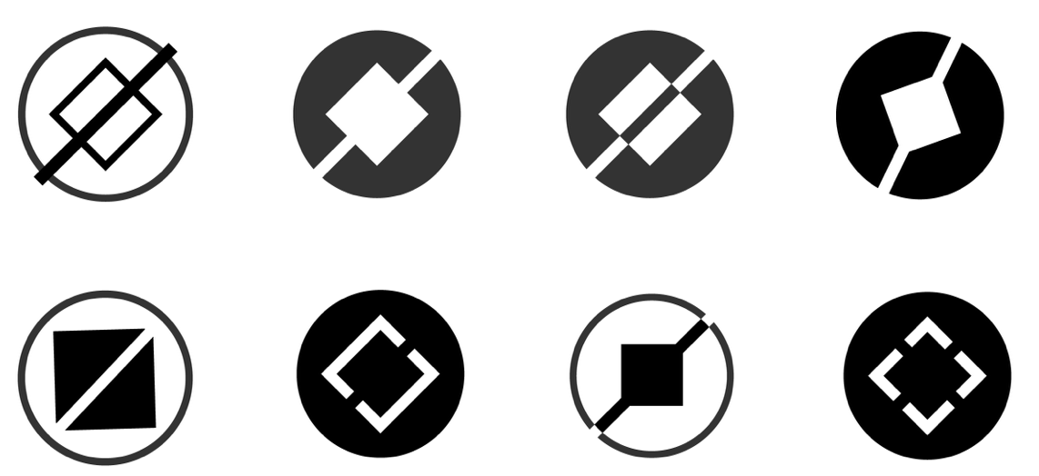
As these things go, we landed on two strong but different ideas. We began to pick them apart, and do anything we could to make them stronger. We refined the ideas and began to apply type and colour. There was only one limit to work within: We are keeping our name “Tapadoo”. And one open question to be explored: Should we keep any reference to the old logo?
We decided that a subtle nod to our past was a good thing, we are extremely proud of or history, and in that vein we decided to included the colour orange in the logo as a reference to this.
With that, one idea won out, and we are proud to say that from today, we will be living under a newly branded Tapadoo, one that represents our ethos both internally & externally.
![]() We hope you’ll come to recognise and love our new logo over time, and please come say hello if you see any new Tapadoo swag out in the wild.
We hope you’ll come to recognise and love our new logo over time, and please come say hello if you see any new Tapadoo swag out in the wild.
Thanks for reading the Tapadoo blog. We've been building iOS and Android Apps since 2009. If your business needs an App, or you want advice on anything mobile, please get in touch