At WWDC this year Apple announced its biggest design update to macOS with the introduction of Big Sur. It’s packing new features like sidebars and widgets, and there are updates to the appearance of windows and the dock. But what’s really got the design community talking is the update to the visual style of the new Mac app icon set.
What’s changed?


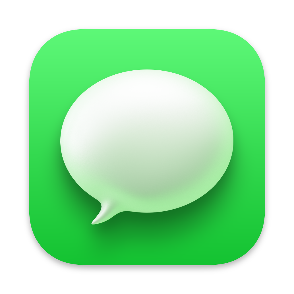

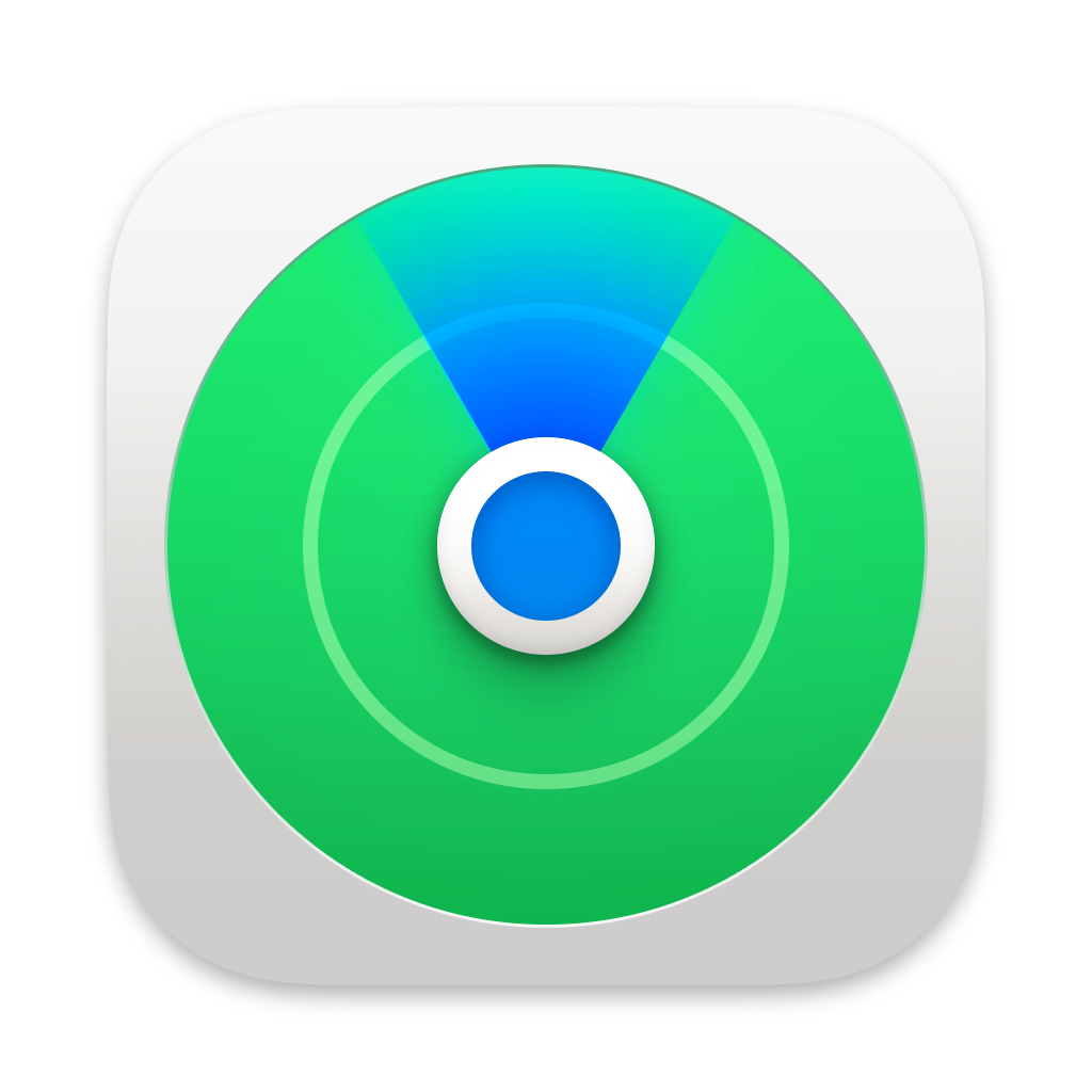
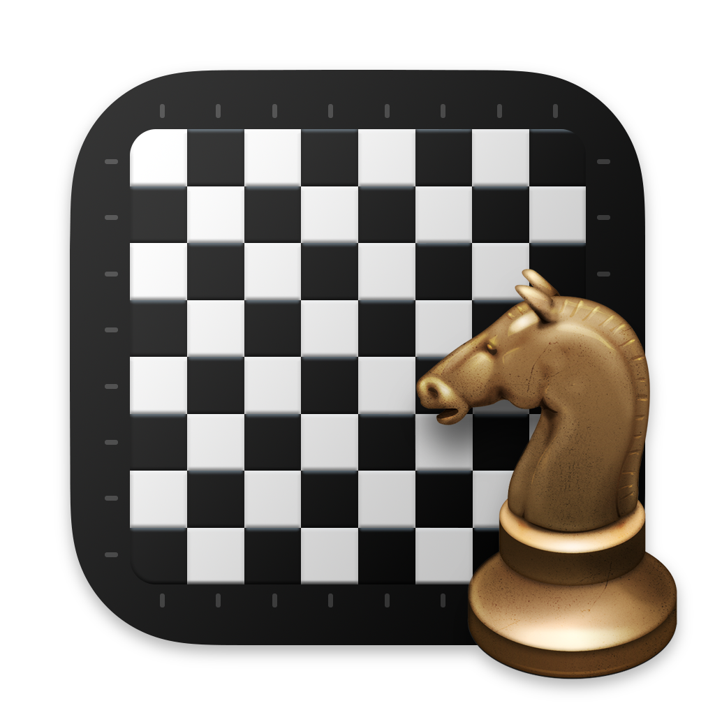
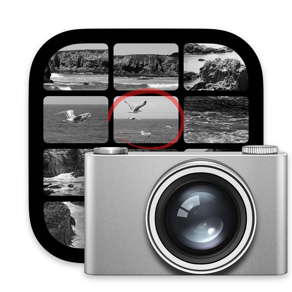
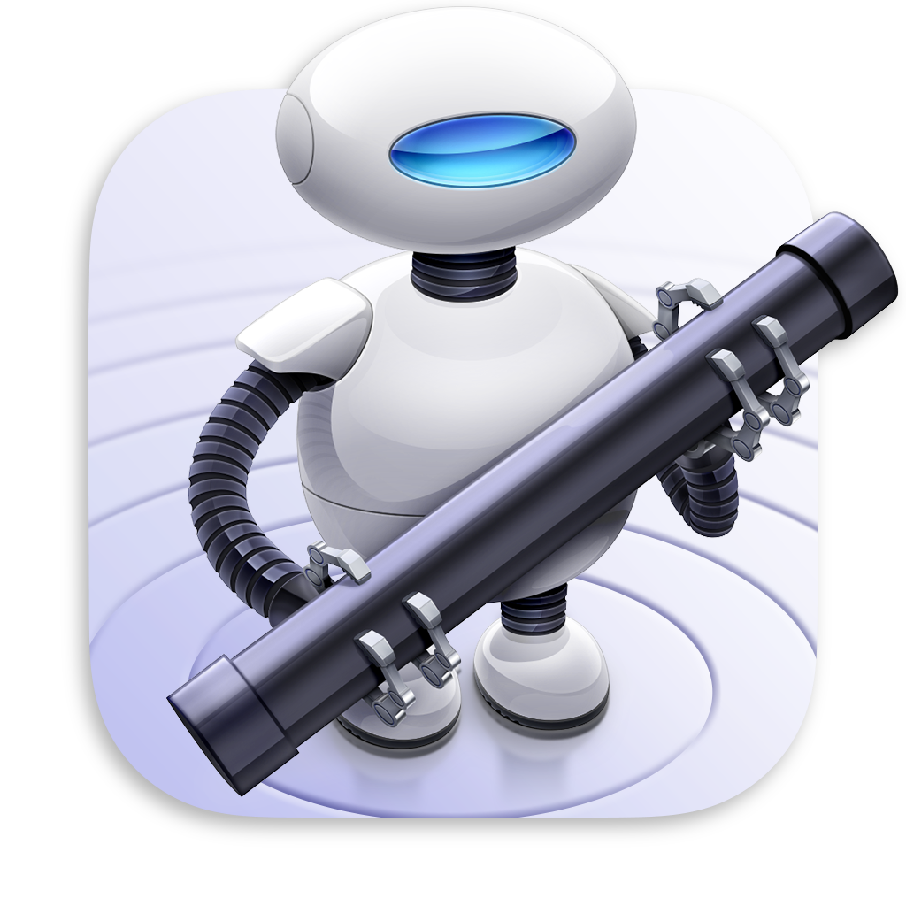
Selection of new icons from Big Sur
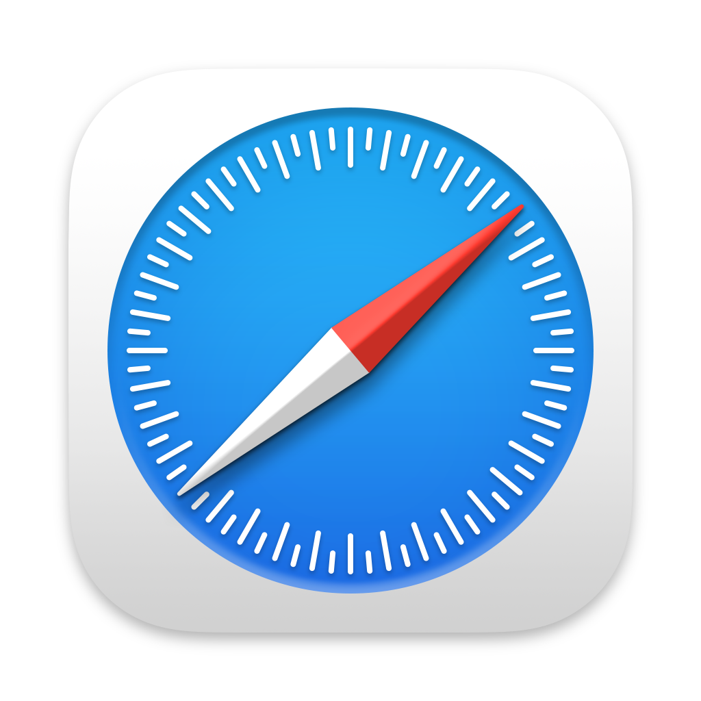
Apple has pushed the icon design into their infamous squircle shape. While some icons have elements which break the boundaries of the squircle, most have made the transition to being confined to its borders. This works well for most icons, however, forcing a natural circle shaped icon like Safari into a squircle shape seems a little unnatural. The background of the icon becomes just a space-filler. Cult of Mac has put together comparison views to show the changes.
However, what’s sparking the biggest divide is the introduction of depth, light and shadow on icons. Some people say it’s erring on the side of skeuomorphism (where a digital representation tries to look as realistic as possible), but it hasn’t quite gone that far. It’s been branded “neumorphism”. With neumorphism, the icons use 3D shapes which give more depth to whatever the graphic is on the icon. Whether it’s a raised speech bubble or a realistic camera, there’s depth being applied. On the contrast though, Apple has pulled some of it’s more traditional realistic icons, like the Mail “stamp” app icon. This will bring it more in line with what’s seen on iOS on iPhone and iPad.


While some icons shapes are raised and sit independently on top of the app icon’s shape, others are confined to a circle, inside a squircle.
Many have stated their disdain for the new style. While others have rejoiced with the re-introduction of a more skeuomorphic (although not quite) approach. Skeuomorphic design aims to retain the look and feel of it’s real-world counterpart. People are describing the new design style as a more “expressive” opportunity for designers. Understandably, being “expressive” can scare designers and/or developers who like to follow a design system. But for many designers it’s a welcome opportunity to flex their creativity (again) and take on the challenge of creating something that portrays what the app does, but has a somewhat more tactile feel to it.
It’s complicated
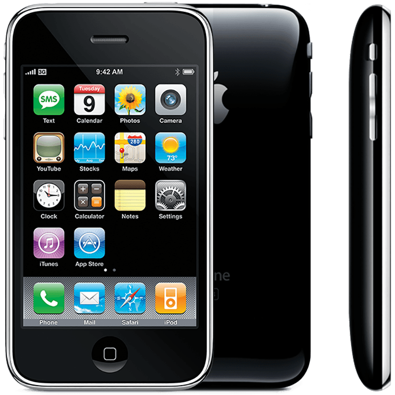
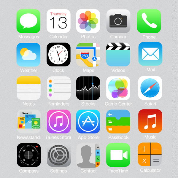
Let’s take a step back for a minute. When the iPhone was released in 2007, Skeumorphism was a necessary design approach to help people make the paradigm shift from physical objects to digital touch based interfaces.

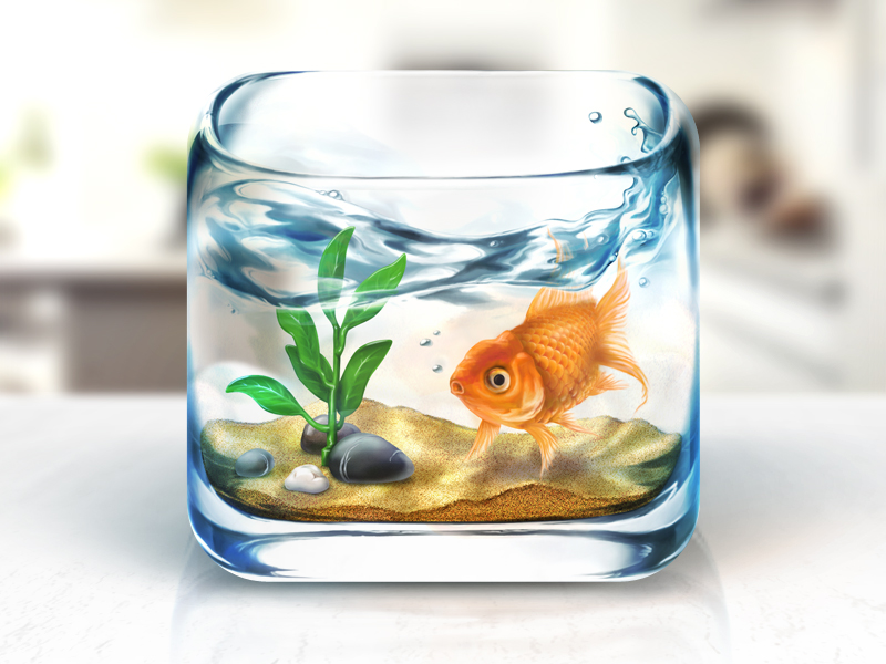
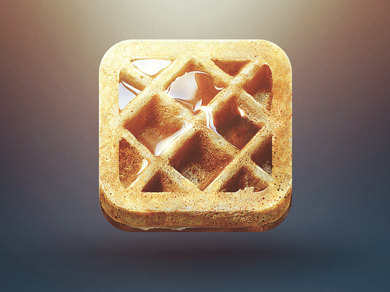
Examples of Skeuomorphic App Icons
Needed a button on screen? Make it look like a 3D button on screen. Designing a radio app? Make all the controls look like the physical controls you’d expect to see on a radio. Simple right? Well not really. Without the experience with 3D software, back in the day many of us were knee-deep in hundreds of photoshop or illustrator layers adding hints of light, shadows, gradients, and textures to create a “better than the real thing” look. The life-like quality of your app icon used to be seen as a status symbol, and the most important marketing tool for your app in the App Store. Companies were willing to spend a lot of money to get an icon that showed incredible amounts of detail.
Moving forward to the introduction of iOS7 in 2013. Apple took a complete u-turn on its design stance and promoted a zero frills approach to all elements of their native design on mobile. While Mac OS didn’t quite get the same treatment, after the introduction of iOS7, suddenly a whole pool of 3D/Skeuomorphic designers were forced to drop their drop shadows, textures, and needed to strictly follow the design guides they’d been handed by Apple or risk their product looking outdated. This strict design approach allowed many designers to quickly enter the market and gave developers a design system to follow to aid them in creating a unified app experience across iOS devices.
We lived in the land of minimalistic design for a long time. And it helped educate many designers and developers in the space to focus on the only what was needed, about focusing your time on getting the core UX right. However, for something to be simple to use, that doesn’t necessarily have to mean that it is minimalist. While restrictions are a natural part of a design process, they can also stifle creativity and innovation.
Trending right now
In 2018/19 we started to see the introduction of barely-there shadows, and subtle light hitting UI Elements again. This is where the term neumorphism starts to become more popular.
Over time, no matter how “good” a design system is, it can begin to feel outdated. In terms of “good design lasts forever”, this doesn’t always apply in the digital landscape. And just like the fashion industry, digital design also goes through trends which people decide they either like to follow or to stick to what they’re comfortable with.
When it comes to digital design trends people generally fall into a couple of different states of mind:
- I don’t like change. Why did you change it???
- I didn’t realise I was bored looking at it until you changed it. I like change for change sake.
- I’ve been waiting for the return of skeuomorphism for 7 years! Bring it on!
- I don’t really care as long as it doesn’t break anything.
People dislike change, this is a completely natural reaction. But undoubtedly people will get used to the changes and begin to adjust their own styles to fall in line with the latest trend. Otherwise, their product suddenly becomes the one that looks outdated. Others will always hold onto the comfort that lies in nostalgia.
There’s also the group who truly believe that the older design is fundamentally better than what Big Sur is proposing in the future, and that’s OK. It’s important for the design community to keep producing designs that come from passion rather than repetition. For designers to be able to create something that fits into a system but also stands out as being a great design.
Many have pointed out execution flaws in Apple’s new icon set for Big Sur. And it’s likely many of these app icons will be further refined before they’re released to the public. It’s not the work that Apple is doing here that excites me. I’m excited about the work of the incredibly gifted designers from 7 years ago getting to produce and experiment again. It’s the younger generation of designers who missed out on the skeuomorphism days who are going to bring another entirely fresh look at app icon design.
Why are Apple making this shift now?
Well of course it makes sense to have a unified look and feel across all Apple devices. This is surely going to make its way onto iPhone and iPad too. But it’s also the first step for Apple to gradually shift the AR design paradigm onto the mainstream iPhone user. From parallax, to blurs, to light hitting digital space and reintroducing depth into their interface design. This is only the beginning of something much much bigger in terms of where Apple is bringing us. When smart glasses are released eventually, it’s likely they’ll have design paradigms that Apple have already begun to gradually introduce to its customers, while also fitting in with the wider iOS design ecosystem.
Handy links:
Figma macOS Big Sur Icon Template : https://www.figma.com/community/file/857303226040719059
Thanks to Ben Ward for all the updated icons in one handy downloadable set https://appletldposts.com/download-all-of-the-new-icons-in-macos-big-sur-here/
Dribbble has already exploded with Big Sur redesigns https://dribbble.com/tags/big_sur
.blocks-gallery-caption { margin-left: auto; margin-right: auto; text-align:center } .blocks-gallery-caption em { font-size: 14px; font-style: normal; }
Thanks for reading the Tapadoo blog. We've been building iOS and Android Apps since 2009. If your business needs an App, or you want advice on anything mobile, please get in touch